
Lets Start with truth, Not Proper Images sizes cause Cumulative layout shift – CLS.
But I Choose FlyingPress / Cloudflare Over any Images Plugins in WordPress because both plugins also have these features means less Plugins. We talk about later in suggestion sections.
Lets Begins the tutorials.
- ON – Recommended
- DEPEND – Consume Server Resources / Test Your Self / What You Want.
- OFF – Break Your Site or Slow Your Site
Click On Advanced
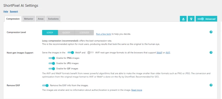
1. Compression:
Compression Level – ON
- Lossy – Small size, slightly lower quality.
- Glossy – Good balance between size and quality.
- Lossless – Original quality, larger file size.
Next Gen Support – ON
WebP and AVIF are new types of Next Gen image formats made for the web. They’re designed to make images smaller in size while keeping them looking good.
WebP images are about 26% smaller than PNGs and 25-34% smaller than regular JPEG.
AVIF images are even smaller, about 50% smaller than JPEG. However, not all web browsers support AVIF yet, so you might run into problems if you use it.
Remove EXIF – ON
EXIF data is like a set of notes that your camera or software adds to a photo. It includes things like where the picture was taken, the date and time, camera details, and more.
SPAI usually make images smaller by removing this extra information, except for the color profile.
Short Pixel tested this on about 7,646 images, and here’s what we found:
When we kept all the EXIF data, the total size was about 791.144 MB. When we removed the data, the size was about 723.552 MB.
So, taking out the EXIF data made the images about 8.5% smaller on average.
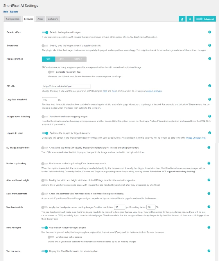
2. Behavior:
Fade In effects – DEPEND
By default, ShortPixel Adaptive Images loads images only when they are about to be seen on the user’s screen. This prevents sudden image appearances. The plugin also gently fades in images for a smoother experience. However, if you have issues with this or don’t want fading, you can turn it off
I Not a Fan of lazy loading because it’s a smart way to improve page scores, but it doesn’t mean your site is Good Speed. You should check TTFB of your website.
Smart Crop – DEPEND
Difference B/W SPAI & SPIO ?
SPAI – Smart cropping mainly works with background images set using CSS. Regular images in HTML tags usually don’t need it. SPAI uses image width and height to decide if it should use smart cropping, but the image should not fully fit the page, often achieved with “background-size: cover” in CSS
SPIO – Smart cropping in improves both the original image and its thumbnails by focusing on the right part, making them sharper and more visually pleasing. The thumbnails may be a bit larger, but the quality boost is worth it.
I generally prefer manual way because plugins consume server resources. Many useful features in these plugins are turned off & Depend which negatively impacts on your server. As a WordPress developer, I’m just informing you, your server needs to respond faster.
Replace Method – ON
Short Pixel Adaptive Images (SPAI) changes the way it replaces images on a website with optimized versions.
- SRC (experimental) – ON – It replaces images using the “src” attribute, which is the main image source. It also provides a backup for browsers that don’t support JavaScript.
Generate <noscript> tag – Enable this option if your browser doesn’t work well with JavaScript. It helps a tool called SPAI work correctly without disabling JavaScript completely. - BOTH – Similar to SRC, it also keeps the “srcset” attribute, which describes multiple image sizes. It doesn’t resize them, though.
- SRCSET (experimental) – This method only replaces images in the “srcset” attribute. It’s important to note that you usually don’t need to choose this method to have “adaptive images.” “SRC” method already takes care of serving adaptive images.
Use BOTH or SRCSET only if you’re directed to do so by support or if you’re absolutely sure you need them
API URL
Short Pixel Adaptive Images works by changing the web addresses (URLs) of your images when someone visits your website. It does this because it serves optimized images from its own special storage.
It change start part of this URL (https://cdn.shortpixel.ai/spai) is important. It tells SPAI where to find the optimized images.
If for some reason, you want to use a different system to deliver the optimized images, then you can change this part. But be careful because it’s a technical change.
Don’t change this setting unless you really know what you’re doing! Be Careful.
Lazy Load Threshold
This setting controls when images load on a web page. The default is 500 pixels, meaning images load when they’re 500 pixels away from being visible.
- A higher value loads images early but may slow the page.
- A lower value might briefly show a blank space before the image appears.
If unsure, don’t change it. You can’t turn off lazy loading entirely, but you can exclude specific images.
Images Hover Handling – OFF
Enable these images if you want them to change when visitors hover their mouse over them, such as turning Gray logos into coloured ones, changing black and white portraits to coloured ones, or showing a different product image on hover.
Logged in Users – DEPEND
The default setting optimises images for both logged-in users and visitors. You can turn it off to save resources, but then it won’t optimize images while you’re logged in.
Note – Image Checker tool won’t work if you disable this option.
LQ Image Place Holder – DEPEND
LQIP, or Low-Quality Image Placeholder, is like a stand-in for high-quality images on a web page. It’s a tiny, low-quality image that loads quickly when you open a web page.
Then, once the page is fully loaded, these placeholders get replaced by the actual high-quality images.
LQIPs are great because they are very small in size and help web pages load faster, especially on slower mobile connections.
Short Pixel Adaptive Images (SPAI) does this cleverly by using a local cache on your website to store these placeholders, reducing the number of requests and helping with SEO, and they don’t consume any extra credits.
You might need to clear this cache if you replace images but keep the same names so that the correct LQIPs display.
Native Lazy Load – ON
In WordPress 5.5, images are lazily loaded by default. If you have activated this Option, it handles lazy loading, and here’s how it works:
Native Lazy Loading – SPAI will make your images lazy load just like WordPress does by default. The difference is that SPAI will also optimize and resize these images for better performance.
JavaScript Lazy Loading – It use JavaScript to handle lazy loading. This is more efficient because it loads only the images that are likely to be seen, especially on shorter pages with fewer images.
Note: In Both case, there is no compatibility issue either & there will not be any duplicated attributes or any conflicts with WordPress’ default behaviour.
Alter Width & Height – ON
If you want the image size attributes to match the actual image size after resizing. It’s helpful if you’re having issues with images on different screen sizes. However, it won’t add these attributes.
This won’t fix the warning message “Image elements do not have explicit width and height” on tools like Page Speed Insights.
Sizes From Post Meta – OFF
this setting in SPAI helps it figure out the size of each image it’s optimising. It tries different ways to do this
- It looks at the image’s filename, especially if the dimensions are in the name.
- It checks the image itself on your server.
- If it can’t find the size by these methods, it checks a database for the image size info.
Enabling this option makes SPAI perform this database check when necessary. If you disable it, SPAI skips the database check.
You might want to disable it if your website’s database is working too hard when SPAI is active & Layout Shifts when Browser Rendered It.
Size Break Points – ON
It figures out the perfect size for each image based on your visitors’ devices, which is awesome because:
- Your website loads faster since it doesn’t waste time on oversized images.
- This fixed the warning message “Image elements do not have explicit width and height” on tools like Page Speed Insights & Gt Metrix.
But, sometimes, you might want to set some rules.
This is where “size breakpoints” come in. They’re like rules that say, “Hey, if you’re resizing an image, make it this size or a bit bigger.”
For example, imagine your smallest image size is 50 pixels wide, and you set a “rounding factor” of 10%. This means SPAI will serve images at sizes like 50px, 55px, 61px, 67px, and so on.
It’s a bit like taking bigger steps instead of tiny ones when deciding the image size.
This can help your website work even better by reducing some hiccups, especially if you have lots of different page sizes. However, it might make your images a little larger than they need to be in some cases. But don’t worry, they’ll still look great.
New AI Engine – DEPEND
Short Pixel Adaptive Images (Version 3.0.0) brings a faster “New AI Engine” that doesn’t need JQuery, boosting website performance.
If you face problems, you can switch back to the old method. The advice is to use the new engine and contact support if issues arise
Top Bar Menu – DEPEND
This menu contains a maximum of three elements:
- Clear CSS Cache – Only shows up if the option Replace in CSS files is enabled.
- Clear LQIP cache – Only shows up if the option LQ image placeholders is enabled.
- Settings – Redirects to the Short Pixel AI settings.
You will have to refresh the page once in order to see the changes.
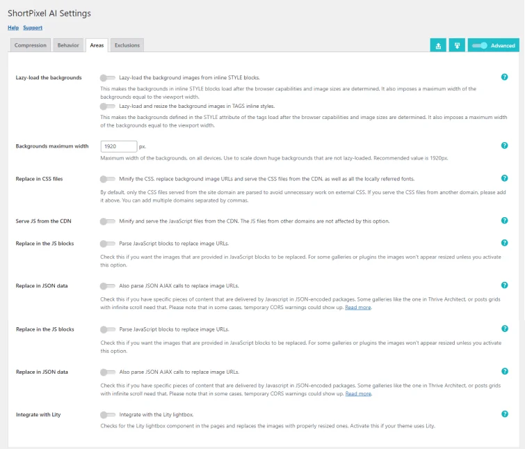
3. Areas:
Lazy Load the Backgrounds – ON
Lazy-load the background images from inline STYLE blocks – if you have background images in inline style blocks on your HTML page, this option will lazy load them and therefore properly resize them. Example:
<html>
     <head>
	<title>ShortPixel</title>
	   <style>
	body {
		background-image: url("https://www.example.com/background.jpg");
 				background-color: #cccccc;
 			}
 	    </style>
     </head>
 	<body>
 		...
	</body>
</html>
Lazy-load and resize the background images in TAGS inline styles: if you have background images in the style attributes of your HTML tags, this option will lazy load them and therefore properly resize them. Example:
<div style="background-image:url('https://www.example.com/background.jpg')">...</div>Background Maximum Width
This option will impose a maximum width on your background images. Knowing that lazy loading is required in order to create adaptive images, this is useful in the following cases:
- You simply want to have a maximum width.
- You disabled the option Lazy-load the backgrounds, but you still want to limit them.
- You excluded some backgrounds from lazy loading on the Exclusions tab, but you still want to limit them
Replace in CSS Files – DEPEND
SPAI added in its version 1.4.0 a new feature called Replace in CSS files.So we can replace the background images on CSS files with an optimized version. SPAI will do its job for such files, which is:
- Minify the CSS files.
- Look for background images (CSS property background-image) and optimize them
- Serve both the CSS files and the background images from our CDN, which means that SPAI will replace the URLs of the background images.
if enabled, works by default for CSS files on your domain. If you have CSS files from other domains, you can add them on the text box, separated by commas.
It’s also worth mentioning that SPAI will not change the structure of the CSS files, will not move CSS from the head to a file or back, nor will not merge files.
SPAI works fine with other plugins that minify CSS files. You can enable minification in SPAI and the other plugin, but if there’s a conflict, it’s best to let SPAI handle CSS minification
Serve JS From CDN – DEPEND
To serve your JavaScript files (ending in .JS ) from our CDN and optimize them, enable this option. It won’t affect JavaScript files from external domains
Replace in the JS Blocks – DEPEND
Some plugins or themes have galleries or other effects where images are served in JavaScript blocks, either separate JS files or inline JS snippets.
For example, you may have a little script on your homepage that sets a background image like this:
<script>
	function changeBackgroundImage() {
        	document.body.style.backgroundImage = "url('https://example.com/wp-content/uploads/image.png')";
	}
	document.addEventListener("DOMContentLoaded", changeBackgroundImage());
</script>
If this is the case, you will need to enable this option if you want Short Pixel AI to optimize these images. Once enabled, you will also be able to choose to lazy load these images.
If you don’t lazy load them, the images will not be able to be properly resized either.
Replace in the JSON Data – DEPEND
Some parts of your website, like sliders or interactive elements, need to fetch data from your website in a special way. This data often comes back in a code-like language called JSON, which contains important info, including links to images.
JSON AJAX calls to replace image URLs – Tells Short Pixel to look inside this JSON data and replace any image links it finds. But there’s a catch: Short Pixel doesn’t always know exactly where these images will show up, so it might not resize them perfectly.
Lazy-load JSON URLs – It replaces those image links with ones that load lazily, which means they’ll be resized correctly by Short Pixel’s special code.
- If your site uses this special JSON stuff, turn on both options and save.
- If images vanish with both options on, try turning off “Lazy-load JSON URLs.”
- If you still have missing images, turn off both options.
When you test your website, reload a page twice. Sometimes, images might not display perfectly on the first load but will be fine after.
To check if your site uses this JSON stuff, use your browser’s Developer tools (press F12 or Cmd+Alt+’ on Mac) and look at the network activity. If you see anything starting with “{” or “[“, it’s a JSON call. If you find URLs with your website’s name (like “https://example.com/…”), these options can help you out.
Integrate With Lity – DEPEND
Lity Light box is like a magic box on your website. It makes images pop up and look fancy when you click on them. If your website uses this magic box, you should turn on this option in the plugin.
When it’s on, the plugin will make sure that the images inside the magic box are the right size and look really good.
By doing so, the plugin will check for the Lity light box component in your pages, and it will replace its images with properly resized and optimized ones.
If you are not sure whether you are actually using Lity, follow these instructions:
- Go to any page that has images opening on a light box.
- Right Click then Click on View Page Source.
- Press Ctrl + F to open the Find Bar.
- Look for the text
data-lity. - If you get any results, then you are using Lity and you should enable this option.
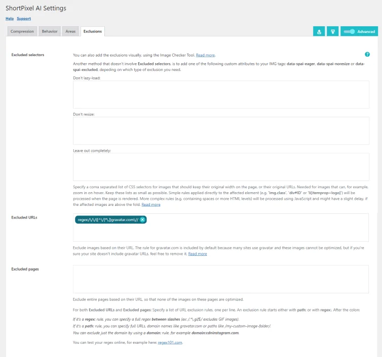
4. Exclusions:
Excluded Selectors
You can choose specific parts of your website to treat differently with SPAI. You can specify which parts of your website to exclude from SPAI’s optimization.
- Don’t lazy load: These areas won’t be lazy-loaded but will still be optimized and resized. They won’t be delivered in the WebP format.
- Don’t resize: SPAI will optimize but won’t change the size of these areas.
- Leave out completely: SPAI will ignore these areas entirely, no optimization or resizing.
| Lazy load | Resizing | WebP Serving | Optimization | |
| Don’t Lazy load | No | No | Yes | Yes |
| Don’t Resize | Yes | No | Yes | Yes |
| Leave out Completely | No | No | No | No |
Excluded URL
You can tell the SPAI tool to ignore certain images on your website by specifying their web addresses (URLs).
To exclude these pages, you can just enter the complete URL of the page for groups of images or specific paths for individual images.
Excluded Pages
This option lets you tell a plugin not to do anything on certain pages. It’s like turning off the plugin’s features for those pages.
To exclude these pages, you can just enter the complete URL of the page.
5. Clear CSS Cache:
If you keep serving the old CSS file, the old images will persist. Clear the CSS cache to update them.
Pricing:
Short Pixel Adaptive Image have is 3 Pricing Plans:
a – Unlimited Plan
| Domain | Price |
| 1 | $8 /month |
| 5 | $33 /month |
| 10 | $58 /month |
b – Monthly Plan with Unlimited Websites
| Data | Monthly Plans Price |
| 500 Mb | Free |
| 35 GB | $4 /month |
| 80 GB | $9 /month |
| 275 GB | $25 /month |
| 500 GB | $42 /month |
| 1 TB | $84 /month |
c – Credit Plan with No Website – Only CDN
| Data | Fixed Price |
| 50 GB | $10 |
| 150 GB | $20 |
| 250 GB | $30 |
| 500 GB | $59 |
| 850 GB | $99 |
| 3 TB | $249 |
Suggestions:
I prefer using FlyingPress, and Cloudflare Pro – Mirage and Polish – (Sometimes it’s Free built in with some hosting like Rocket Net, which has Cloudflare Enterprise, far better than the Pro version & Cloudflare is a CDN & DNS Not a Plugin ).
These plugins offer features that eliminate the need for multiple overlapping plugins, streamlining your workflow and site maintenance.
If I’m looking for free plugins, I’d choose Short Pixel Adaptive Image. We discuss in detail about Best Images Optimization Plugins in a Blog.
| Flying Press | Cloudflare Pro | Short Pixel | |
| CDN | Flying CDN | Mirage and Polish | Own |
| Resize | Yes | Yes | Yes |
| Lazy Load | Yes | Yes | Yes |
| Compression | Yes | Yes | Yes |
| Responsive | Yes | Yes | Yes |
| Free Plan Limit | No Free Plan | No Free Plan | 500 Mb |
| WebP | Yes | Yes | Yes |
| Other Features | Extreme | Normal | Low |
| Price | 60/Year+ | 20/Mo | Free |
Comments for Algorithm, Peace Out.
Leave a Reply